2020 Election: Could Trump’s claims have merit?
An analysis of voting data from Georgia, Michigan, Pennsylvania, and Wisconsin
Trump has been claiming on Twitter that the election was stolen and rigged. His legal team has said that they have evidence of this. Most of the mainstream media as well as big tech companies have called these claims baseless and unfounded. Twitter has been putting warnings on many of Trump’s tweets.
Is it possible that there could be some truth to what he is saying? I decided to take a look at the data for myself. I will start with a disclaimer that I am a software engineer and not a statistician so what I am presenting is my own analysis and opinion and is not scientific.
Data source
The data I am using comes from The New York Times who in turn got it from Edison Research. A sample data URL for the state of Pennsylvania is https://static01.nyt.com/elections-assets/2020/data/api/2020-11-03/race-page/pennsylvania/president.json. I have also downloaded and archived the data offline and may provide it later or post it on Github.
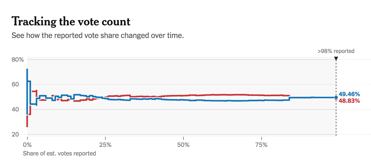
One observation I have noticed about the way the media displays the data is that they tend to use percentages for everything. Take, for example, this graph from Wisconsin:
Plotting the share of votes (%) for each candidate on the y axis instead of the total number of votes makes it difficult to see large jumps in the number of votes that come in late. For example, a large jump near the end of counting will not create as big of a shift as it would in the beginning. If 20,000 votes come in when only 100,000 votes have been counted that represents a 20% swing in votes, but if 20,000 votes come in after 1,000,000 votes have been counted, that represents only a 2% swing.
In addition, using the percent of the total votes received on the x axis makes it impossible to see things like gaps in the data when counting stops.
Methods
Before diving in to the specific data, I wanted to provide samples of the graphs I have put together to show examples of states with clear victories for each of the candidates. These graphs make it easier to notice anomalies in other states.
Biden win
Let’s start with Minnesota, a state Biden won decisively.
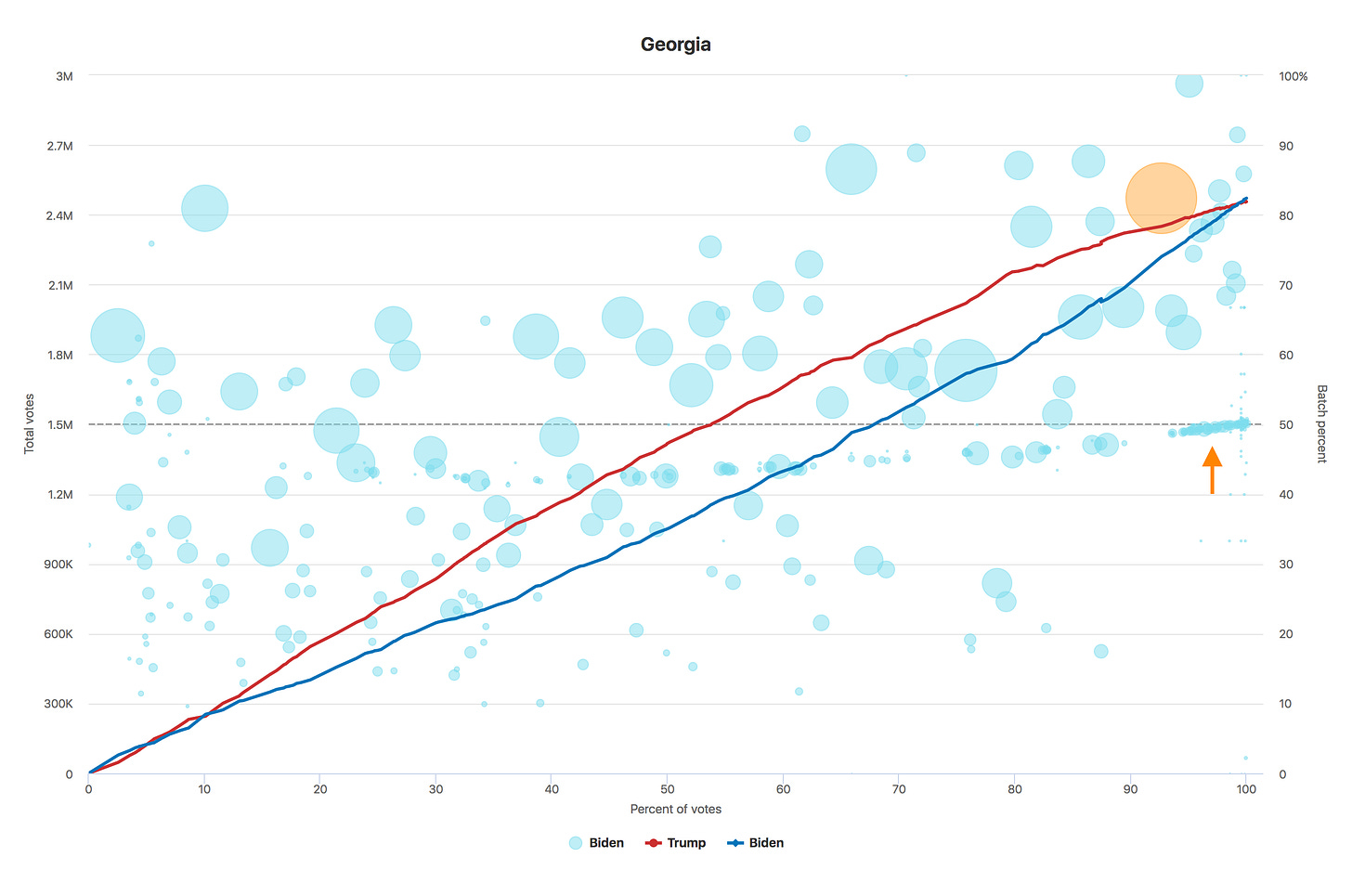
Graph info
The x axis represents the timestamp of when the votes were recorded
The left y axis corresponds to the blue and red lines representing the total number of votes for each candidate. This number is calculated from the total votes and share of votes (%) for each candidate at timestamp t using:
candidateVotes_t = totalVotes_t * candidateFraction_t
The right y axis corresponds to the bubbles representing the percentage of each batch of votes corresponding to a candidate. This percentage is calculated using:
batchPercent_t2 = (candidateVotes_t2 - candidateVotes_t1) / (totalVotes_t2 - totalVotes_t1) * 100
The size of the bubble corresponds to the number of votes in this batch relative to other batches
There is a dashed horizontal line at the 50% mark to make it easier to see who is receiving a majority of the votes over time
I do not know specifically how or when the batches of data are sent in for each state, but it would make sense that any votes counted after the initial election day tallies would be votes received by mail due to the fact that votes in person would already be scanned when the polls close. Given that, one would expect them to be somewhat randomly sampled and for the percentage of votes for a specific candidate to stay roughly constant over time. That is to say, you would not expect to see a huge bubble corresponding to a single county way after the polls have closed. In this example you can see in Minnesota Biden received roughly 54% of all of the votes tallied after election day.
Trump win
Here is an example of a state Trump won decisively, Florida.
Here there is a gradual slant where Biden goes from receiving around 50% of the votes to receiving around 48%, but there is no gap in reporting and it stays consistent until the counting is complete. Presumably this is due to shifting to count mail-in ballots.
One user on Twitter hypothesized that it is natural for a small shift from Democratic to Republican votes due to the fact that it takes longer for ballots mailed to arrive at polling centers from outlying rural areas which happen to also be more Republican leaning. I’m not sure if this is true, but either way it doesn’t appear to be unnatural.

States in question
For this analysis I am going to be focusing specifically on four states: Wisconsin, Georgia, Michigan, and Pennsylvania. All four of these states have some things in common.
Three of the four went to Obama in 2012 (all except Georgia)
They are all states that Trump won in 2016
They are all states that stopped counting votes in the middle of the night after the election (3 Nov.)
They are all states where Trump had a sizable lead at the time the counting stopped
They are all states that Biden ended up winning days later
They are all states that use the Dominion voting software
They are all states that the Trump campaign is contesting the results in
Analysis
Wisconsin
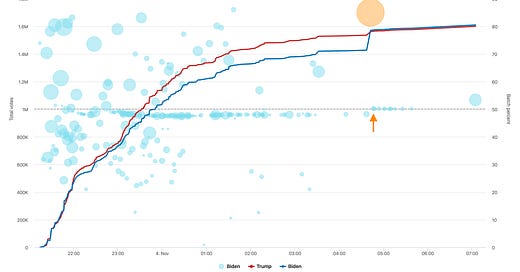
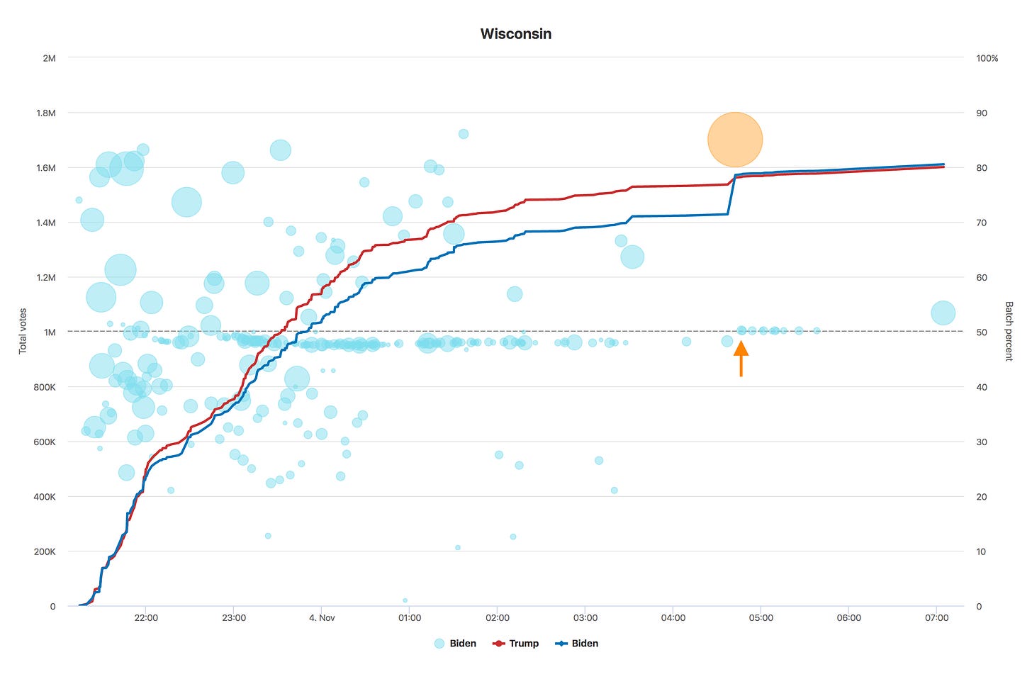
To start, let’s look at Wisconsin. As it stands now, Biden has only a 20,000 vote lead. Here is the data from the start of reporting until he took the lead.
I have highlighted one of the Bubbles orange and added an orange arrow to illustrate how abnormal this batch of votes is. You can tell from this graph that reporting stopped almost completely around 3:30 AM on the night of the election. Just before 5AM, a big batch of votes came in that pushed Biden past Trump, a lead that he has not relinquished. This batch contained nearly 170,000 votes and 85% of them went to Biden. This was also the largest batch of votes reported in Wisconsin during the election.
What makes this unusual is that, for one, the counting stopped before this batch came in, but also you can see the percentage of votes being added for Biden actually changed right around the same time (see the orange arrow). Biden had been getting about 48% of the votes counted post-election, and then suddenly out of nowhere it jumped to over 50%. Now there could be valid explanations for this, but the odds of 10 batches in a row all coming in at a higher percent seem fairly low.
In addition, the fact that 85% of this large batch came in for Biden should raise a red flag since according to the county data (also from The New York Times), the largest margins Biden had in any of the big counties were 75.5% in Dane county and 70% in Milwaukee county.
It is, of course, possible that this large batch of Votes only contained mail-in votes from Democratic strongholds, but why would they suddenly appear in the middle of the night?
When you chart out the data using the percentage of votes counted as the x axis you can get an idea of how many votes were already counted at this point. The answer is 96.6%. Why is it that counting stopped after around 97% of votes were reported and then two hours later this massive influx of new votes arrived for Biden?
Some people on social media made claims that more than 100% of registered voters showed up in seven counties in Wisconsin. Politifact debunked this claim by posting the correct numbers, but even their corrected numbers seem extremely high. According to the Politifact data, the percentages of registered voters that showed up in these seven counties in question were 85%, 88%, 92%, 91%, 87%, 87%, and 92%.
Michigan
Next let’s move on to Michigan.
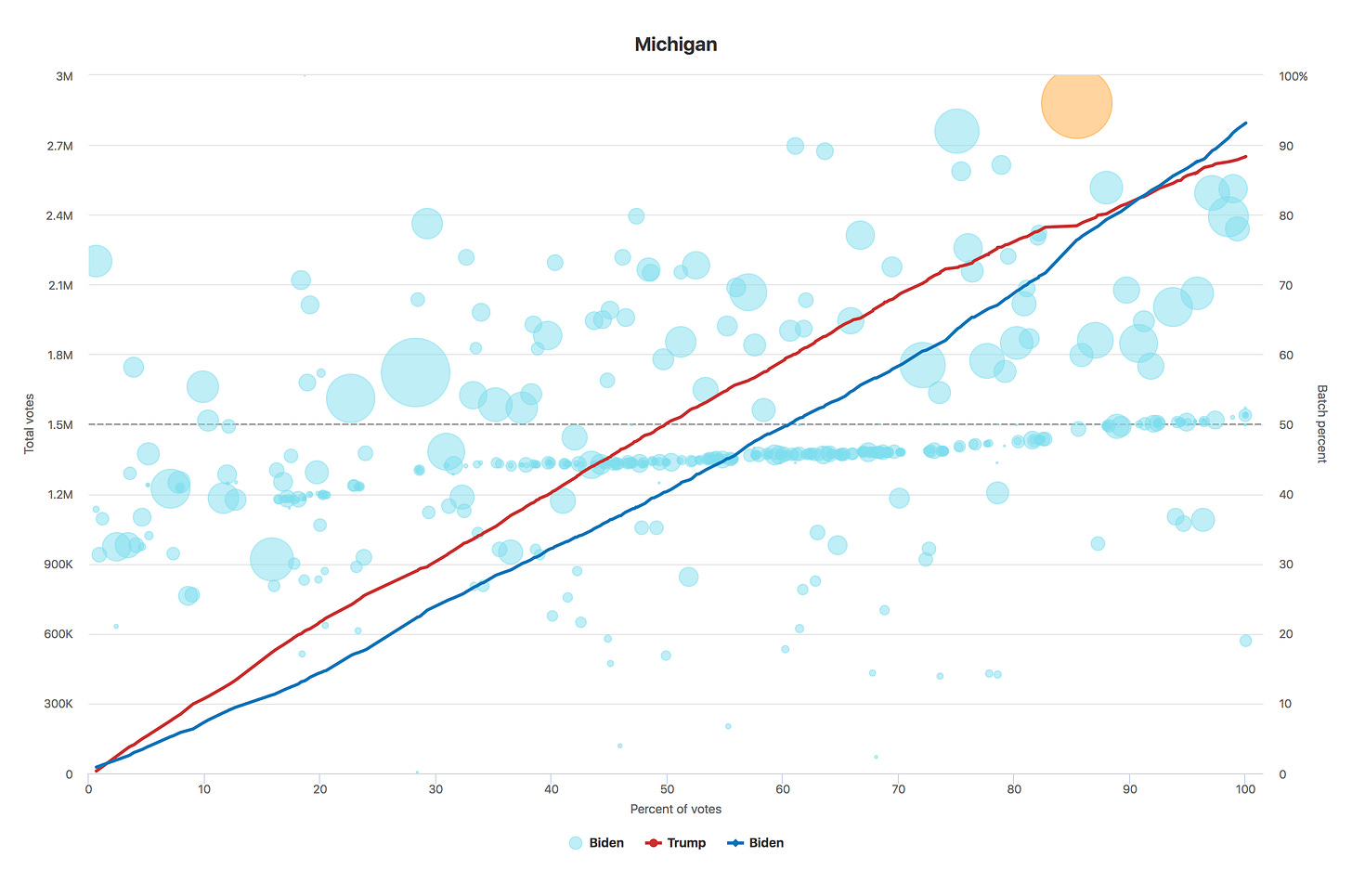
You can see that something similar to Wisconsin happened here as well. Vote counting stopped in the middle of the night and then a little after 6AM a huge batch of new votes came in. In this batch, 96% of the votes went to Biden and he netted around 141,000 votes. In addition to the 96% share being the largest for any batch of Biden votes in this state, it also contained the largest number of overall votes. Also similar to Wisconsin Biden had 72% of the votes in the top county that he won in Michigan so a batch where he received 96% of votes seems improbable.
From this point on, the percentage of votes coming in for Biden shifted too (see the orange arrow). Also, like Wisconsin, this batch came in after most of the votes had already been counted (85% in this case).
Georgia
Georgia is not quite as obvious, but you can see it has a couple of similarities to the others. For one, a huge batch came in in the middle of the night mostly for Biden (the vertical blue spike around 1AM corresponding to the orange bubble). Also if you look at the orange arrow you can see that, like the other states, the percent shifted towards Biden after gaps in counting.
One other oddity in Georgia is the fact that after election night, nearly every batch of votes favored Biden (you can tell by how the bottom part of the chart has no bubbles in it after 6AM on 4 Nov). This seems unusual considering Georgia has a lot of Republican leaning counties.
From this graph you can tell that the big spike actually came in after 93% of the votes had been tallied. This means that at 1AM the night of the election 93% of the votes were already counted, but it took over two more days to count the remainder of the votes that allowed Biden to overtake Trump. You can also see here that the percentage of votes in each batch skewed more and more towards Biden in the final 5% of votes.
Pennsylvania
Finally let’s look at Pennsylvania.
Pennsylvania also had a stop in counting along with a big batch of votes going to Biden in the middle of the night and then a gradual shift of the returned votes towards Biden until 3 days later when he was declared the winner.
It is certainly interesting that as soon as Pennsylvania stopped counting (at around 78% of the votes), the remaining votes shifted progressively in Biden’s favor similar to Georgia. From 45% to 50.5%. I am not sure how this can be explained naturally.
Conclusion
While these charts don’t prove that any fraud occurred, the fact that all four states exhibit similar anomalies is somewhat suspicious. All four states:
Stopped counting votes on the night of the election
Had mysterious surges of new votes mostly for Biden that were added in the middle of the night
Had shifts in the percentage of votes being counted towards Biden after the election and after 90% or more of the votes had already been counted
These were also the last four states to be called. The media warned us for months leading up to the election that this was the likely scenario (for Trump to win on election night, but for Biden to win after all the votes were counted). This hypothesis seems possible, but it does not explain why the later batches shifted more in Biden’s favor as time went on. If the mail-in ballots counted post-election were mostly for Biden he would have received over 50% of counted votes in these batches, but that was not the case in these four states until after the counting was stopped. This is suspicious to me.
Since mail-in ballots tend to randomized/shuffled with regards to the order they are received, it would make sense that the percentage of votes for one candidate should stay relatively constant over time which does not appear to be the case here.
The odds of all four states exhibiting similar strange behaviors and shifts in how many votes were counted for Biden over time seem improbable if this was not somehow coordinated.
